— Concept Project · Fictional venue, not a client
Salt House
Premium hospitality website conceptAvalon Beach, NSW
A digital concept for a modern Australian restaurant and wine bar, designed around atmosphere, simplicity and effortless reservations.
View the live concept (opens in a new tab)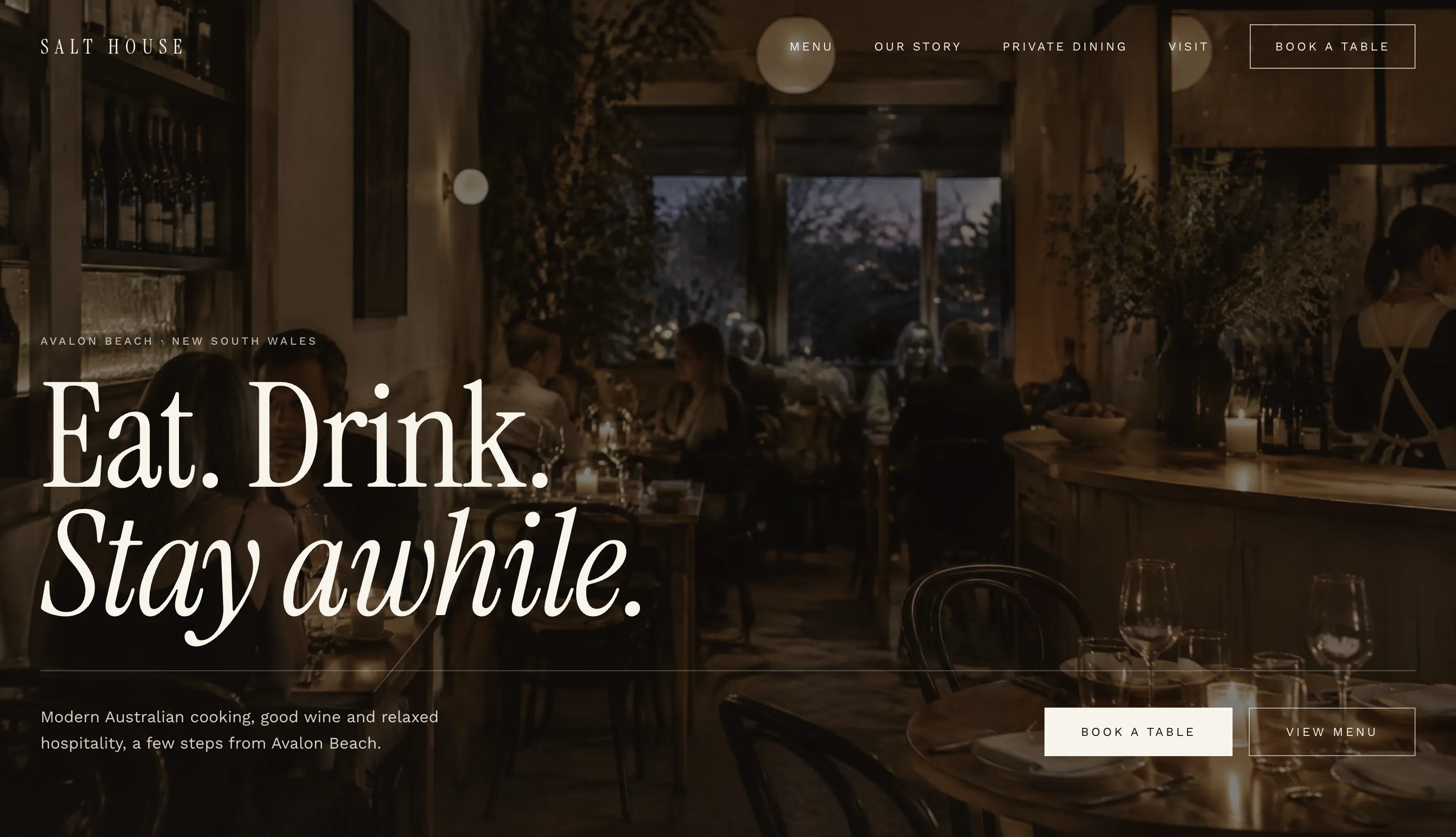
- Sector
- Hospitality
- Location
- Avalon Beach, NSW
- Scope
- Design & development
- Status
- Concept · fictional venue
The Brief
Capture the feeling of the room, not just the menu.
Salt House is a fictional restaurant and wine bar in Avalon Beach, created by North Studio as a concept project — not a real venue or client — to show how we'd approach a brand-led hospitality website.
The challenge was translating the atmosphere of a premium, relaxed dining room — long lunches, low light, a short wine list — into a digital experience, without it collapsing into the generic hospitality template: stock carousels, crowded menus and a booking widget bolted on at the end.
The intent: let photography and space set the mood, keep the writing short and confident, and make booking a table feel as easy as walking in.
Visual Direction
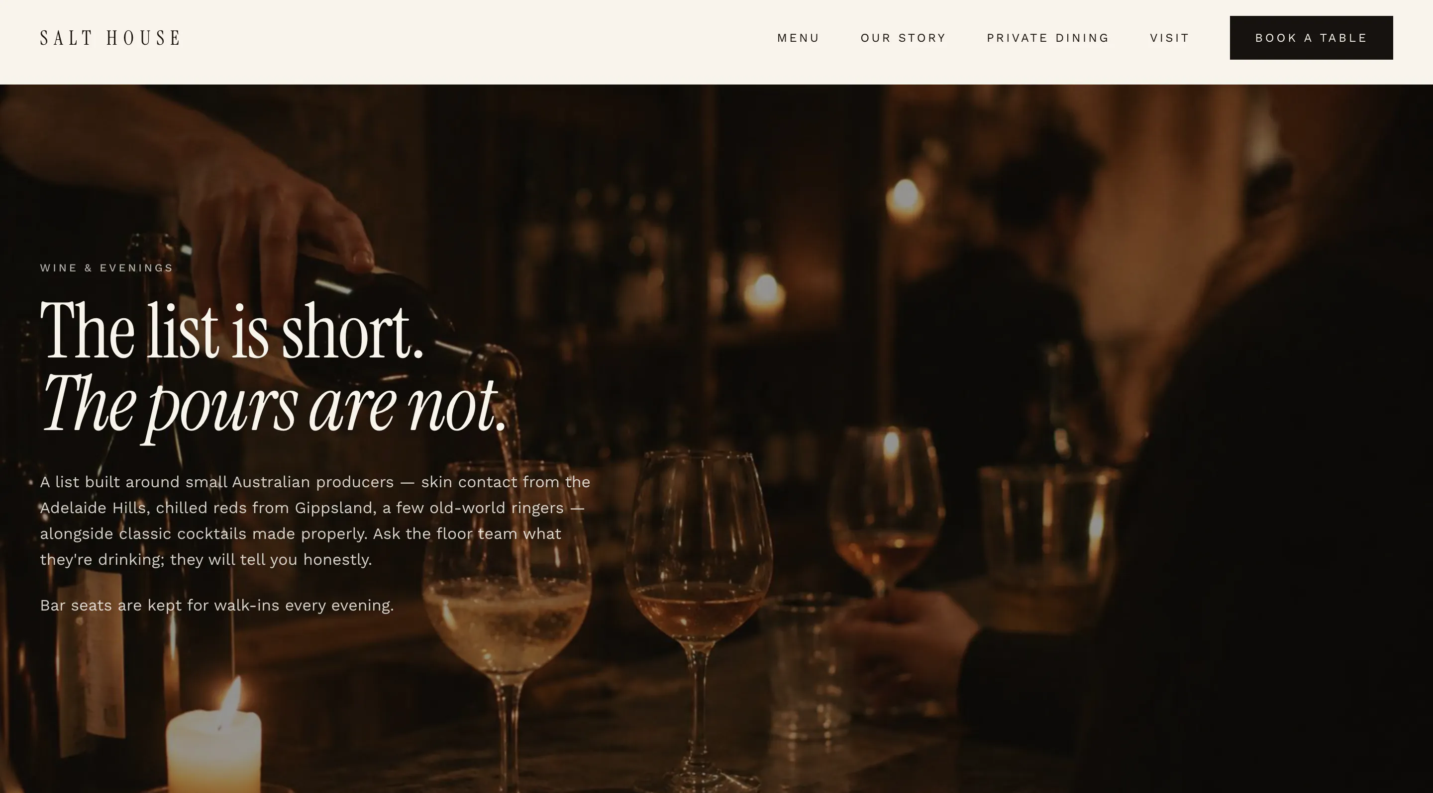
Quiet, warm and led by photography.
01
Editorial composition
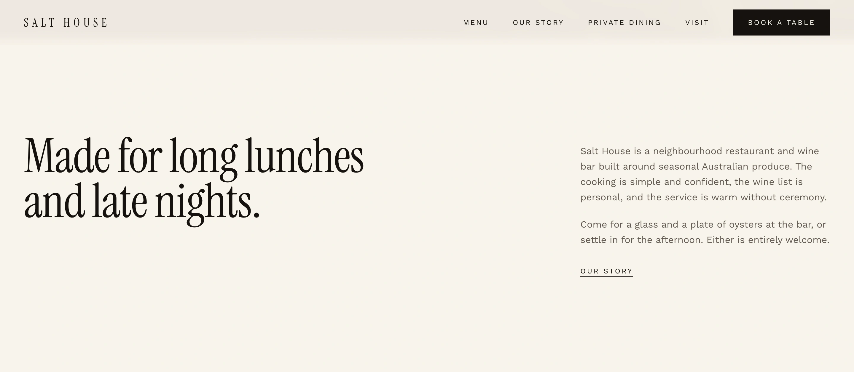
Layouts borrowed from print — generous margins, asymmetric grids and sections that breathe — so each part of the venue gets its own moment.
02
Immersive photography
Large, full-bleed imagery carries the atmosphere. Copy sits alongside it rather than fighting it for attention.
03
Restrained typography
Two typefaces, a handful of sizes and plenty of space. Hierarchy comes from scale and rhythm, not decoration.
04
Warm, premium palette
A small set of deep neutrals and soft off-whites, kept quiet so the photography provides the colour.
05
Brand-led experience
Hours, location and bookings are designed in the venue's own voice — part of the brand, not an afterthought.
Type pairing
- Display
Instrument Serif
Headlines and the menu. A refined, high-contrast serif that gives the site its hospitality voice.
- Text & UI
Work Sans
Body copy, navigation and the booking flow. Neutral and legible at small sizes.
Editorial Showcase
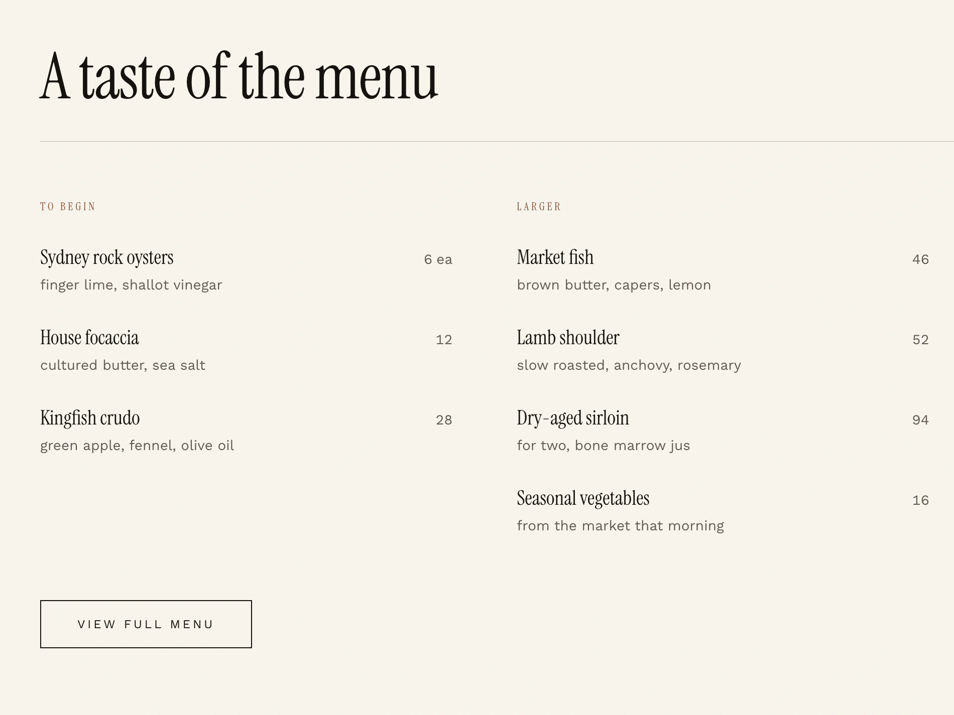
A site that reads like a good menu: brief, considered, unhurried.
Reservation Journey
Booking a table, without the friction.
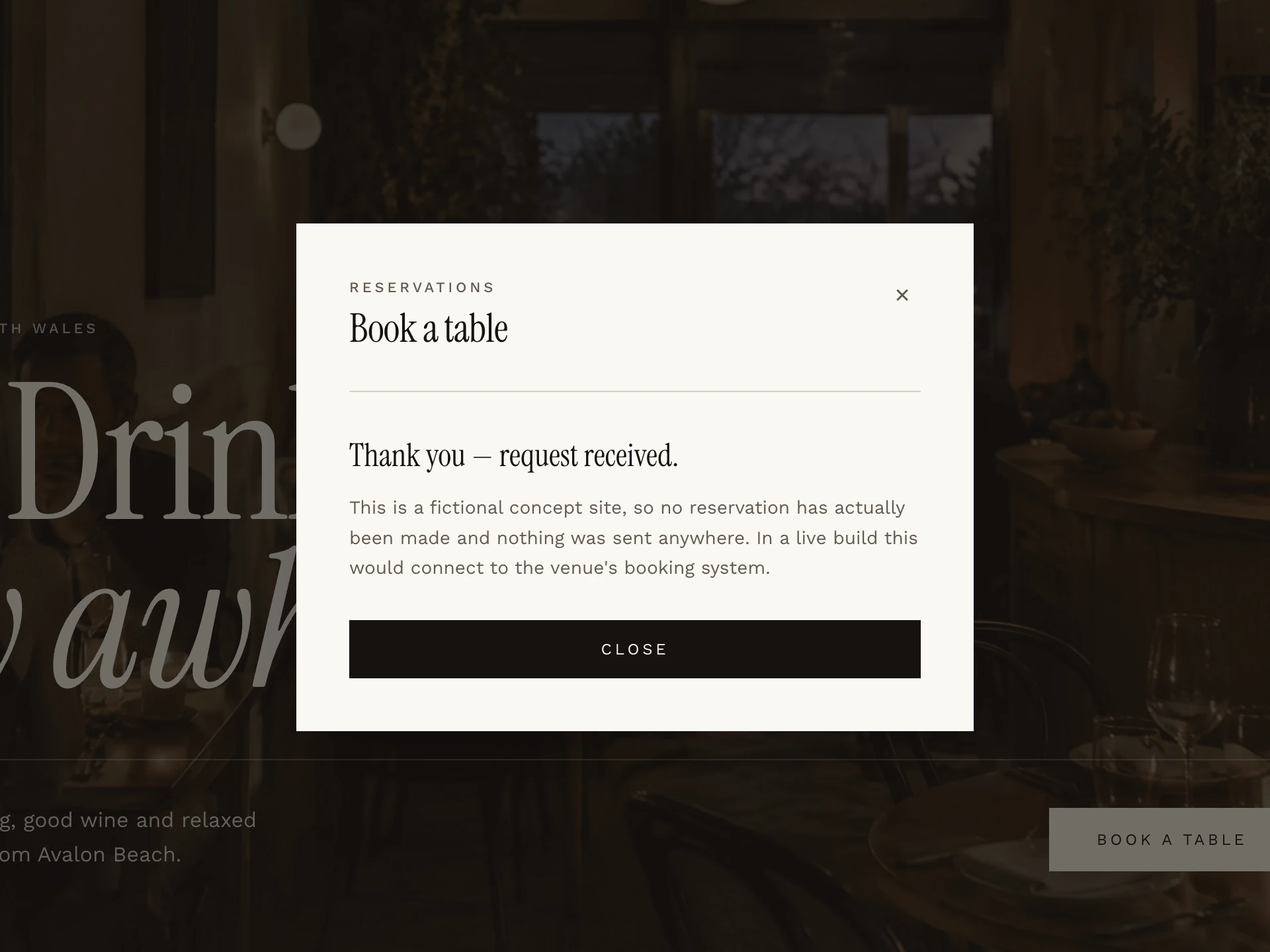
Reservations are the one thing a restaurant website has to get right. The journey was designed to be always within reach, short and calm.
- 01
Always within reach
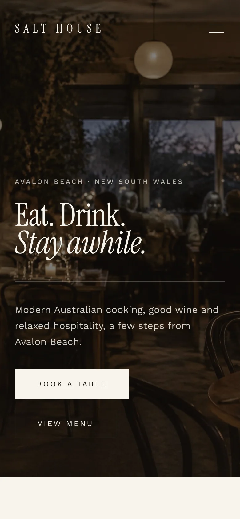
Book a Table stays in the sticky desktop navigation and leads the hero on mobile, so deciding to book never means hunting for a link.
- 02
One simple modal
Name, date, time and party size in a single focused view — no redirect to a separate booking site.
- 03
Minimal friction
Only the details a restaurant genuinely needs. No account, no unnecessary fields.
- 04
Clear confirmation
A distinct confirmation state closes the loop, so guests know exactly where they stand.
- 05
Keyboard & focus
Focus moves into the modal when it opens and back to the trigger when it closes, and Escape dismisses it.
Demo only
The booking flow is illustrative. Nothing is submitted, stored or sent to a real venue.
Mobile Experience
Most people find a restaurant on their phone. So that's where it was designed first.
The photography, menu and booking journey all hold up at arm's length — nothing is a shrunk-down desktop layout.
01Arrival 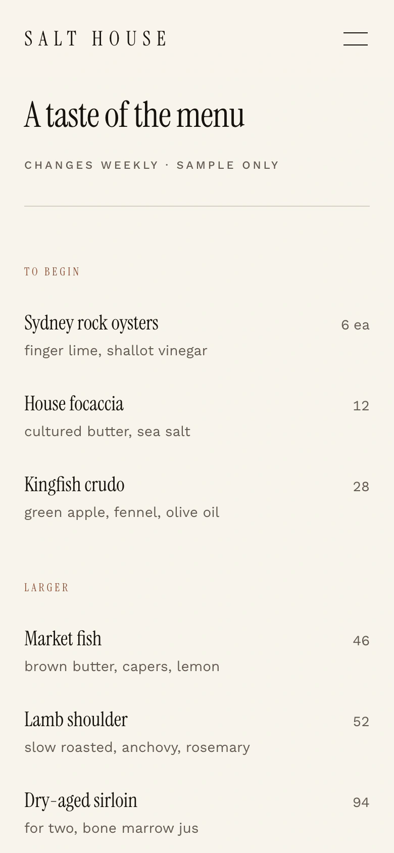
02The menu 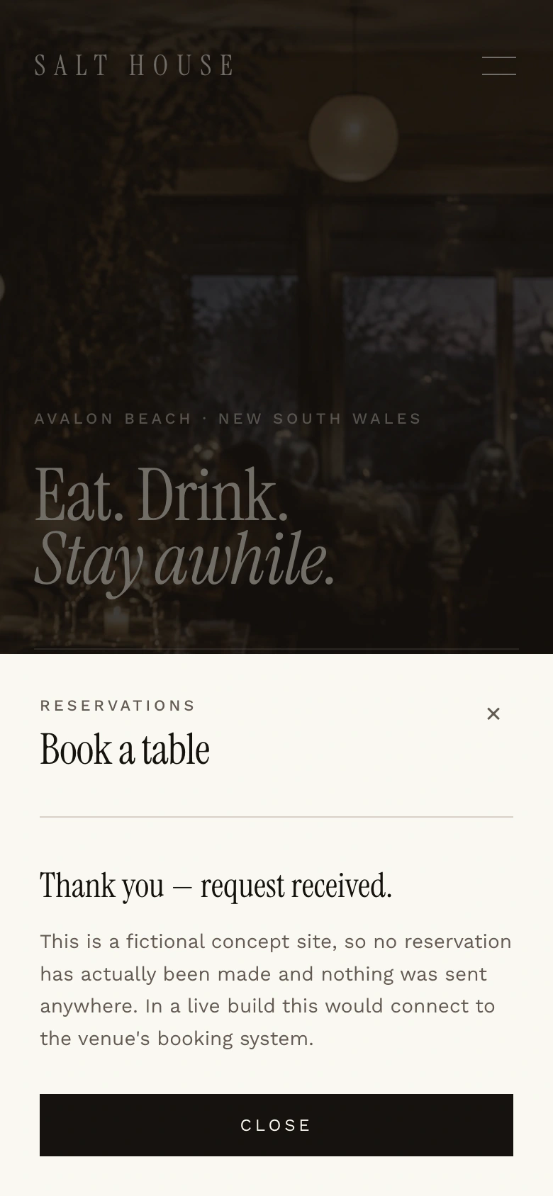
03Booked
What It Demonstrates
A different brief calls for a different website.
A local service business needs its website to turn searches into enquiries. A restaurant needs people to want to be there — and then to book without thinking about it.
Salt House shows how North Studio approaches a brand-led project: starting from atmosphere and identity, then designing the practical details — hours, location, reservations — to feel like part of the same experience.
- Direction
- Brand-led
- Imagery
- Immersive
- Booking
- Effortless
- Devices
- Mobile-first
Step inside.
Explore the full Salt House concept — every section, every breakpoint and the reservation journey.
Salt House is a fictional venue created as a concept project. It is not a real restaurant, and no real bookings are taken.