— Concept Project · Fictional retailer, not a client
Assembly
Premium e-commerce conceptFurniture, lighting & objects
A digital storefront for a fictional Australian design retailer, built around the shopping journey: discovering the range, browsing the collection, choosing a piece and filling the cart.
View the live concept (opens in a new tab)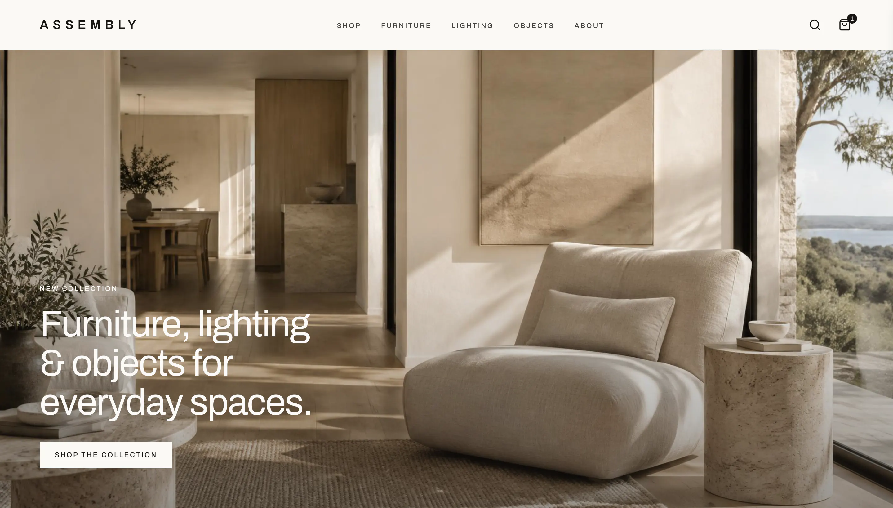
- Sector
- Retail · E-commerce
- Range
- Furniture, lighting & objects
- Scope
- Design & development
- Status
- Concept · fictional retailer
The Retail Brief
Make considered objects easy to shop.
Assembly is a fictional Australian design retailer, created by North Studio as a concept project — not a real store or client — to show how we'd approach a premium e-commerce website.
Design-led retail pulls in two directions. The range has to feel curated and unhurried, but a store still has to work like one: easy to browse, clear about price and options, and quick to buy from.
The intent: let the products carry the page, keep the interface quiet around them, and make every step from first look to checkout feel obvious.
The Shopping Journey
Four steps from first look to checkout.
01Discover
The product is the art direction.
A design retailer is judged on its range before anything else. The homepage opens on the collection in a lived-in room, then hands over to the products themselves.
One art direction
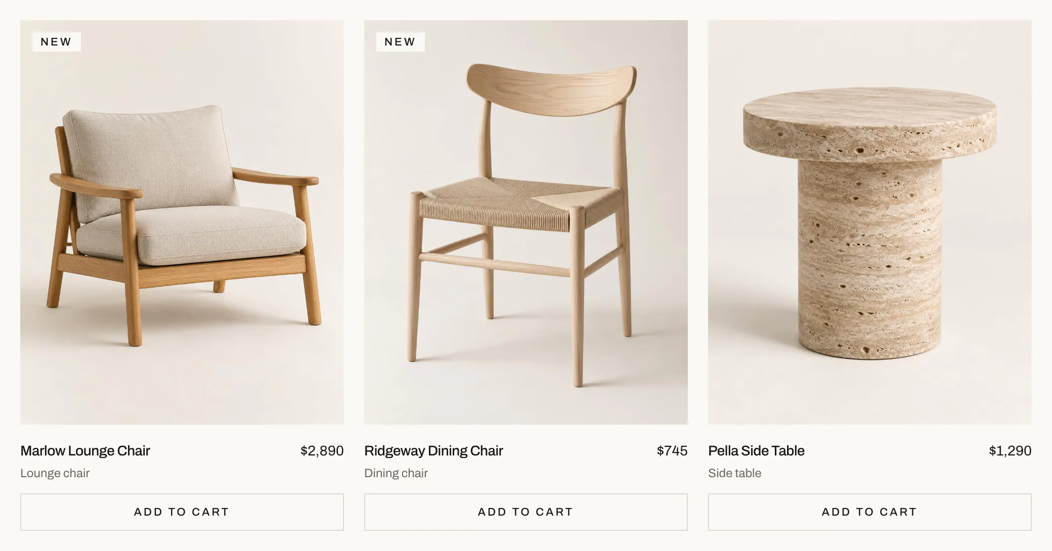
Every piece is photographed on the same warm stone backdrop, in the same soft light, so twelve products read as a single collection.
Three clear categories
Furniture, lighting and objects — the same three words in the navigation, the homepage and the shop, so there is only one structure to learn.
Quiet tiles
Name, type, price and one action. A small NEW marker is the only merchandising flag, used sparingly enough to mean something.
02Browse
Twelve products, narrowed in a click.
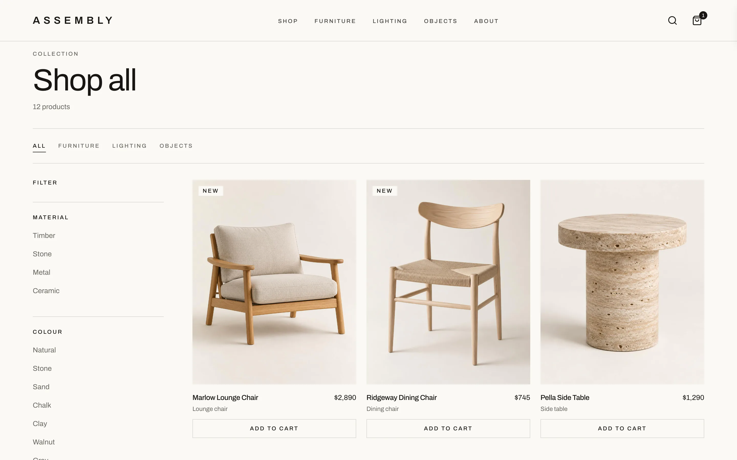
The shop is one page that reshapes itself. Category, material and colour all filter the same grid, so shoppers refine what they're looking at instead of starting again.
Category tabs
All, furniture, lighting and objects sit above the grid and mirror the main navigation.
Material & colour filters
Plain-language options — timber, stone, chalk, walnut — in a sidebar that stays out of the way.
Count & sort
A running product count above the grid and a sort control beneath the filters keep the list feeling finite.
Add from the grid
Each tile carries its own Add to Cart, for people who already know what they came for.
03Decide
Everything needed to say yes.
A product page has one job: answer the questions that stand between interest and purchase, in the order people ask them.
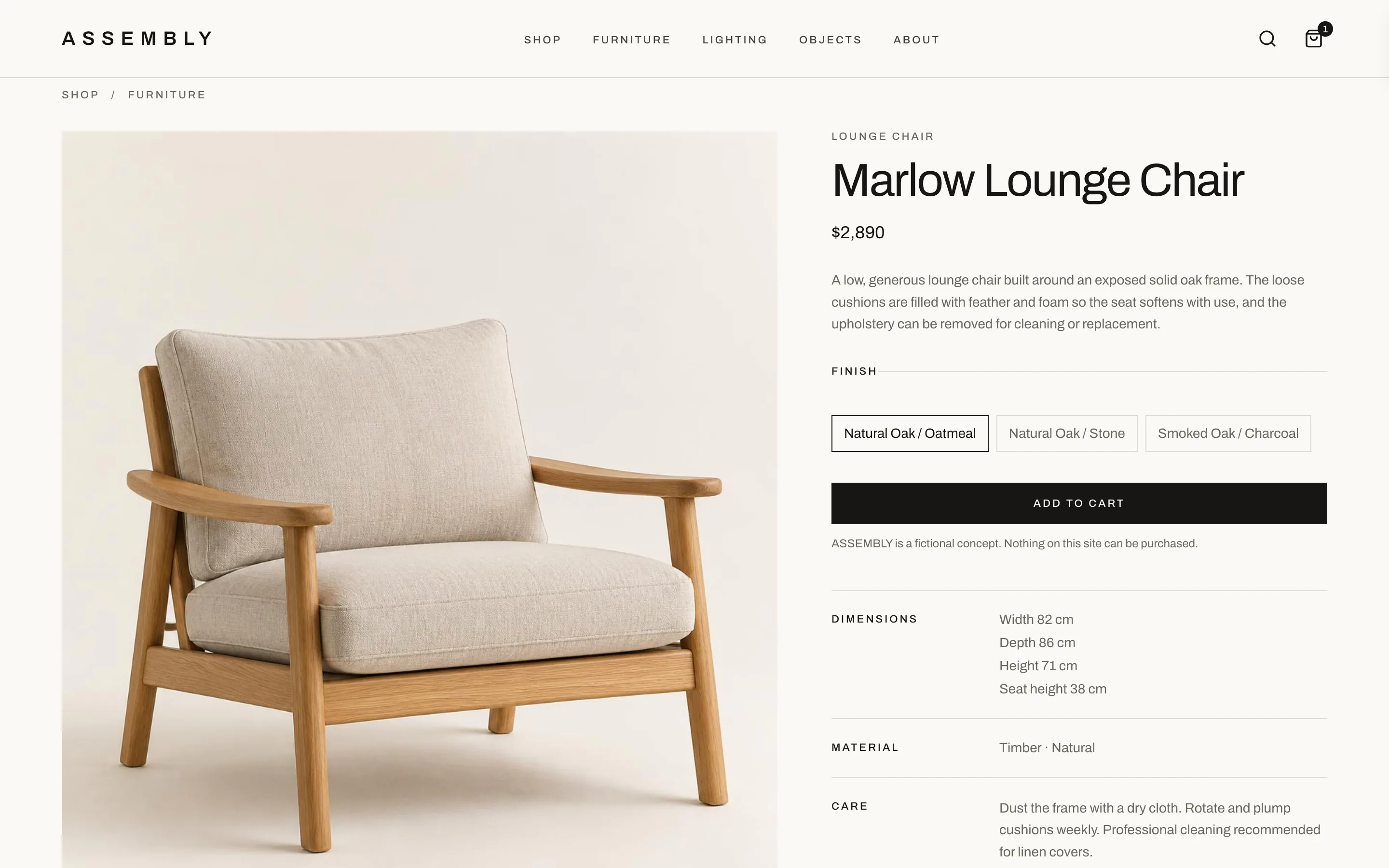
Photography first
The piece takes more than half the page, on the same backdrop as the grid it was chosen from.
Price, finish, action
Finish options are labelled buttons rather than a dropdown, directly above a single full-width Add to Cart.
The practical details
Dimensions, material, care and delivery are set out as a simple list — no tabs to open.
Honest about the concept
A line beneath the button states that Assembly is fictional and nothing can be purchased.
04Buy
A cart that keeps your place.
Adding to the cart shouldn't end the browsing. The cart slides in over the page, confirms what was added and steps aside again.
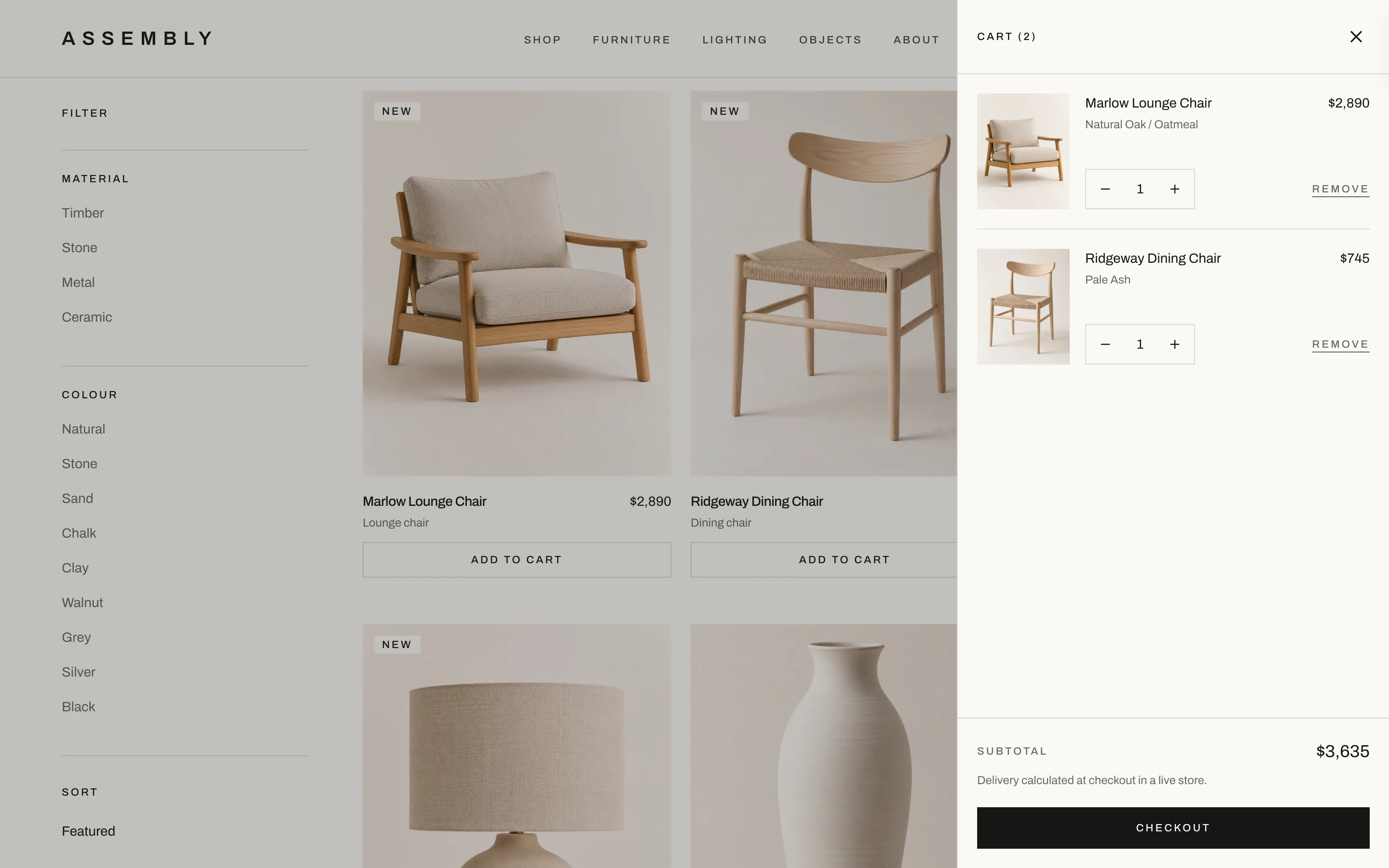
Opens in place
The drawer sits over a dimmed shop page, so closing it returns shoppers exactly where they were.
Edit without leaving
Quantity steppers and Remove sit on each line, with the chosen finish shown beneath the name.
One clear next step
The subtotal and a single Checkout button stay pinned to the bottom of the drawer.
Keyboard friendly
Every control in the drawer is a labelled button, and Escape closes it.
Demo cart
The cart works, but it is illustrative. There is no checkout, and no orders or payments are taken.
Mobile Shopping
The same journey, sized for a thumb.
Most browsing happens on a phone, often in the room the piece is meant for. Photography runs edge to edge, controls are large enough to tap, and the cart takes over the whole screen.
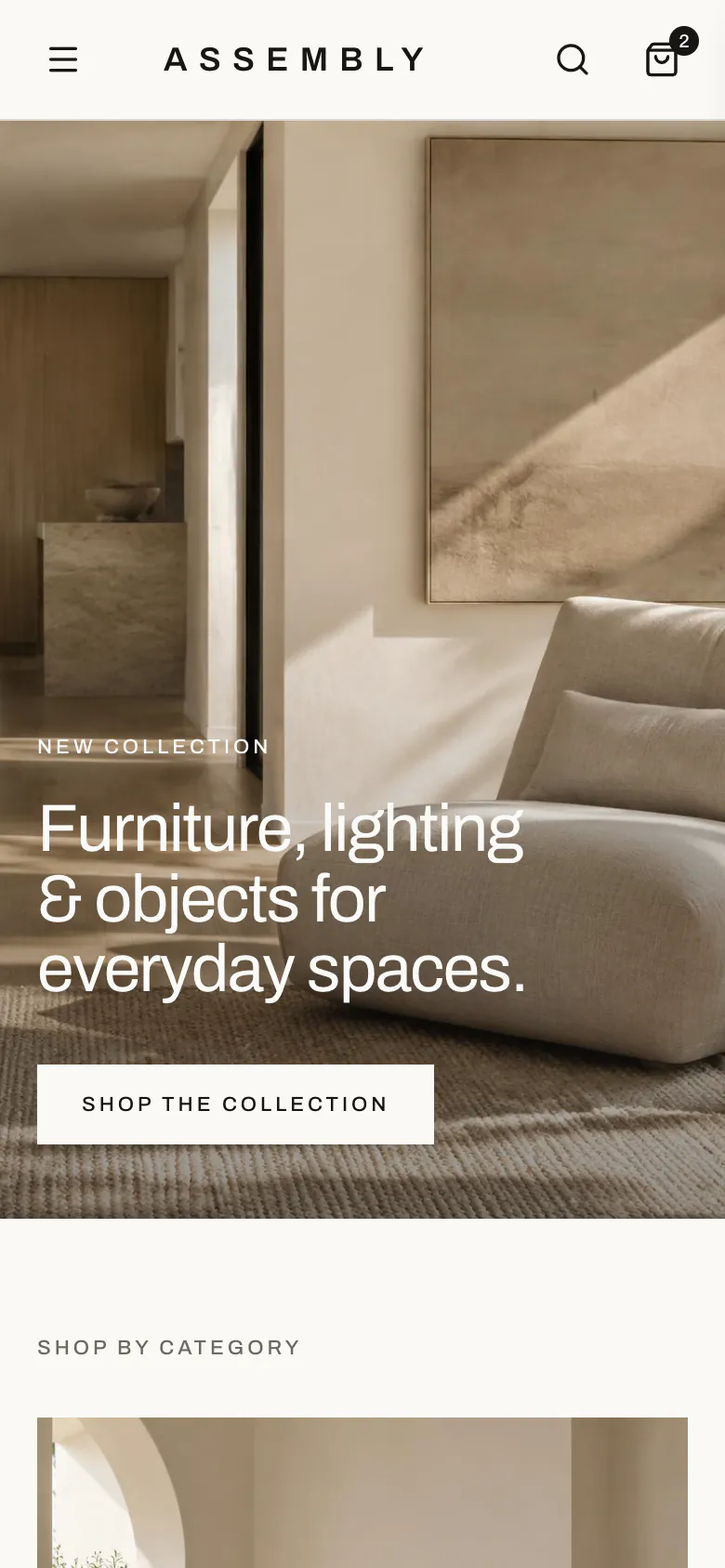
DiscoverThe collection, one thumb away. 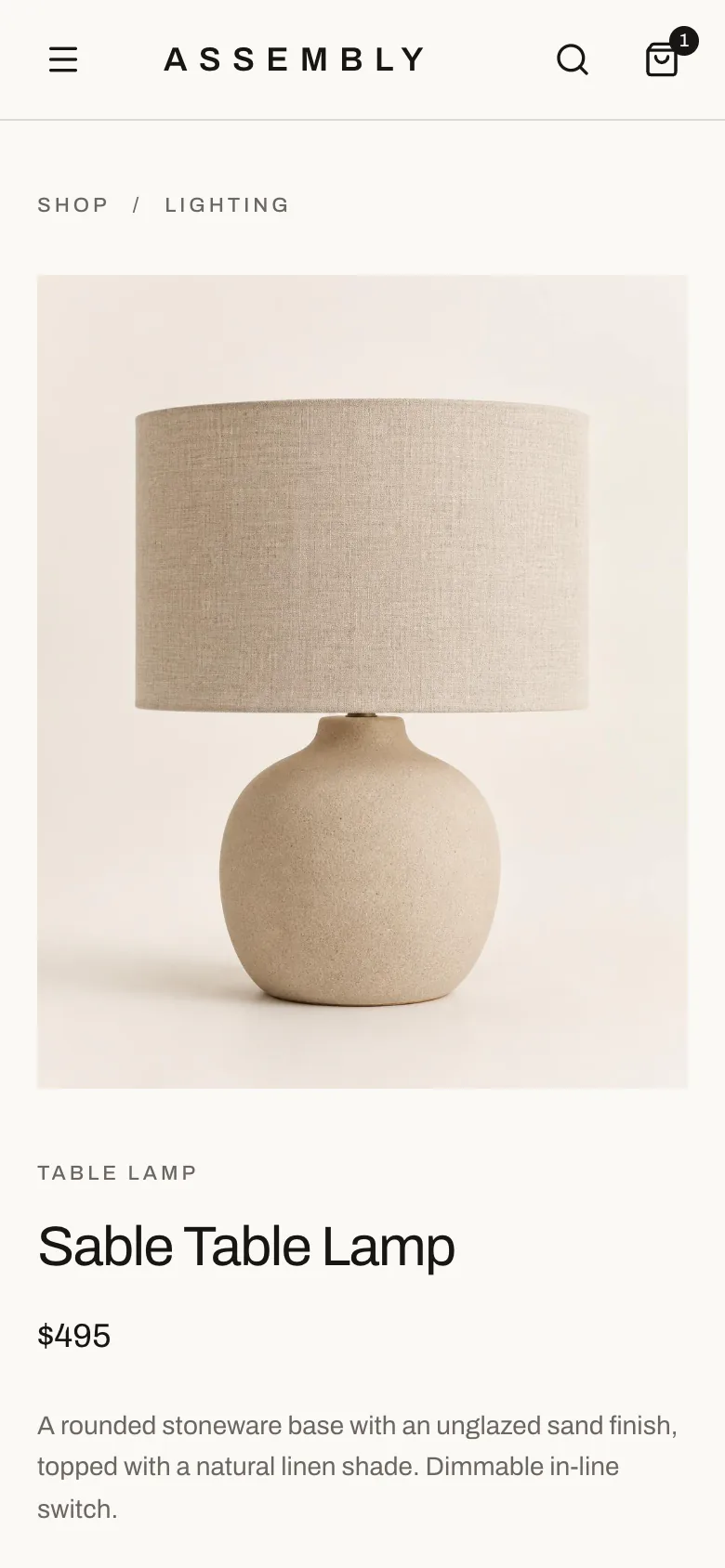
DecideProduct first, details beneath. 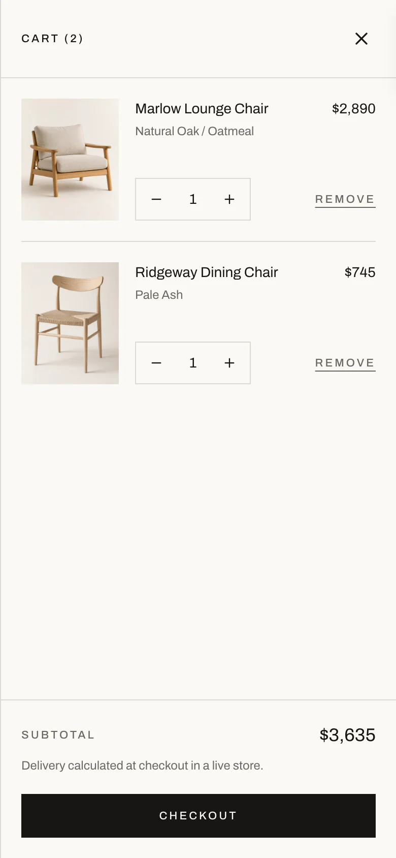
BuyA full-screen cart with a full-width checkout.
What It Demonstrates
Three briefs, three different problems.
Assembly shows how North Studio approaches e-commerce: product discovery, merchandising, filtering, product detail and a working demo cart, held together by one art direction on every screen size.
01 · Northern Beaches Electrical Co.
Enquiries
A local service site that turns a search into a quote request.
02 · Salt House
Bookings
A brand-led site that sells the room, then takes the reservation.
03 · Assembly
Sales
A storefront that helps people find a piece and get it into the cart.
Browse the shop.
Explore the full Assembly concept — filter the collection, choose a finish and fill the cart.
Assembly is a fictional retailer created as a concept project. It is not a real store, and nothing on it can be purchased.